Your website looks great. The design is sharp, the content is professional, and people say nice things about it. But here’s the problem: it’s not doing its job.
Visitors are landing on your site, then leaving. They’re not booking calls, filling out forms, or buying. It’s not a traffic issue. It’s a conversion issue. And it’s more common than you think.
If your site isn’t converting, it’s not working. And that’s a business problem, not a branding one.
Why this matters in plain business terms
A non-converting website drains your time, money, and momentum.
- You spend money driving traffic that doesn’t turn into leads or sales
- You chase opportunities manually that your site should capture for you
- You lose potential customers to competitors with simpler, sharper messaging
But when your website does convert:
- Your sales pipeline fills without constant hand-holding
- You spend less on ads and outbound effort
- You build trust and credibility faster
This isn’t about redesigning everything. It’s about removing friction, fixing missed signals, and guiding your visitors more clearly.
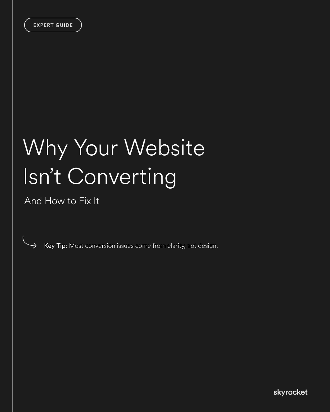
Key Tip: Most conversion issues come from clarity, not design. The number one reason people leave a website? They don’t instantly understand what the business does, who it’s for, or what to do next. You could have the best branding in the world, but if your messaging is fuzzy, your site won’t convert.
What Actually Stops Conversions (And What to Do About It)
1. Unclear value proposition
If someone lands on your site and doesn’t get what you do in the first few seconds, they’re gone.
Fix it:
Your main headline should clearly say who you help, what you do, and what result you deliver. Keep it short, specific, and benefit-led.
Weak: We help businesses grow online
Stronger: Shopify websites that drive more sales for NZ retailers
2. No clear call to action (or too many)
Your visitors don’t want to guess what to do next. If your site has too many buttons or none at all, they’ll freeze.
Fix it:
Every page should have one primary CTA. Make it obvious and consistent.
Example: Book a free call. Start a project. Get a quote.
3. Trust gaps
Visitors won’t take action if they’re not sure you’re credible. Even if they like the design, a lack of proof can make people hesitate.
Fix it:
Add testimonials, logos, reviews, case studies or stats. Show results. Show faces. Show location.
Tip: Local trust goes a long way. Mention you’re NZ-based if that’s relevant.
4. Weak or generic copy
If your website copy sounds like everyone else’s, it won’t cut through. People skim. You have seconds to make your message land.
Fix it:
Write like a real person. Use short sentences. Cut jargon. Be specific about what you do and who it’s for.
Instead of: We offer tailored digital solutions for modern businesses.
Try: We build Shopify sites that convert better and load faster.
5. Slow load time or poor mobile UX
If your site loads slowly or looks broken on mobile, people leave. It’s that simple.
Fix it:
Run your site through Google PageSpeed Insights. Compress images. Remove unnecessary scripts. Test every page on mobile.
Tip: If it takes more than 3 seconds to load or your CTA is hard to tap, you’re losing conversions.
6. No real reason to act now
If your website gives people no urgency, they’ll leave and “come back later” (which means never).
Fix it:
Use soft urgency. Limited bookings. Timely offers. Even just reminding people what they miss by waiting.
Example: Only 2 project slots left this month.
7. Clutter and cognitive load
Too much text, too many sections, too many decisions. It overwhelms visitors.
Fix it:
Simplify your layout. Focus each page on one goal. Use whitespace. Break up copy with headings and bullet points.
Rule of thumb: If you removed half the content, would the page still work? If yes, cut it.
Real-World Example
A mid-size consulting firm in NZ had a well-designed site. But conversions were flat. After a simple homepage overhaul: rewriting the hero headline, reducing clutter, and adding two testimonials. Their lead form completions went up 70 percent in six weeks.
No redesign. No code changes. Just clarity.
Common Objections (and Smarter Responses)
“People don’t really convert from websites.”
Not true. High-intent visitors absolutely do if the site makes it easy, clear, and trustworthy to take the next step.
“Our industry is too complex to explain simply.”
That’s why you need to. If a new visitor can’t grasp what you do without a deep dive, they’ll leave. Simplicity is a competitive edge.
“We just need more traffic.”
More traffic to a broken funnel just means more waste. Fix conversion first, then turn up the volume.
“We’ll fix it later when we redesign.”
You don’t need a full redesign to improve conversions. Copy changes and layout tweaks can drive real impact right now.
What to Do Now
- Read your homepage like a stranger. Can you tell what the business does in 5 seconds?
- Cut or rewrite any vague, fluffy, or generic copy
- Make your primary call to action obvious and easy to find
- Add 2–3 trust signals (testimonials, logos, proof points)
- Test your mobile and loading experience and fix what slows people down
Conversion problems are fixable. And often, it’s the small things that make the biggest difference.
Want a second opinion? Flick us a message. We’re happy to take a look and tell you what’s holding your site back.


